
| UX design + Research |
IT Vendor Checker for U of T
April 2021
Partnered with the University of Toronto to solve the privacy transparency need, we designed the IT Vendor Data Security Check website as a solution to be more transparent to students on information about data security. Communicating to students that the use of their personal information by vendors and services follows privacy principles that support the University of Toronto's mission.
Project type: A school project with real clients. Designed an integrated webpage as the end-to-end solution for searching and presenting desired information to users.
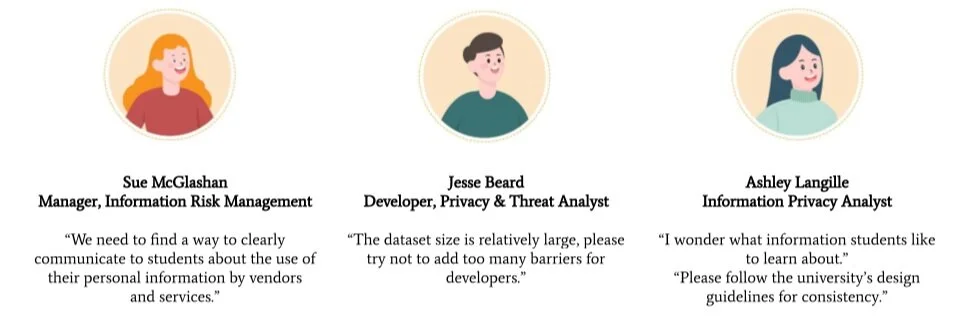
Stakeholders: Information Technology Service - University of Toronto, University Students
Timeline: February to April 2021
My Role: In a team of 5, I prepared user research materials and facilitated 2 interview sessions. I was responsible for stakeholder communications. I designed the homepage, search function, and overall interactions. I led the usability testing by writing scripts, facilitated the testing session, and summarized findings and next steps. I presented our design ideas during stakeholder meetings and to the whole class.
Challenge
How might we solve the “two-way mirror” issue of students’ privacy data usage to reassure them of a safer and more secure online learning experience?
Educational technologies have been commonly used in universities, especially under remote learning scenarios. While those IT vendors can collect students’ data from different levels, the University of Toronto students, as their service end-users, have not acknowledged any data collection and usage details. It created a scenario similar to a two-way mirror: while students can only know their own actions, IT vendors are on the other side of the mirror to “see-through” their private data
Key Design Decisions I Made
Contents to present
Format of deliverables
How to play around with creativity within constraints?
Design Process

Discover
Client Meeting

The Information Technology Service (ITS) at the University of Toronto is responsible for conducting security assessments on external IT service vendors. They initiated a project brief that aims to be more transparent to students on delivering information about data security.
We hold a kick-off meeting and regular weekly meetings with 3 staff from the Information Technology Services (ITS) to gather their project requirements and facilitate product visions.
The Current Data Structure
Below is the (expired) sample list* of third-party vendors and how they can use students’ data. It has a database structure that is only available to internal staff. In other words, students do not have the access to information that ITS and IT vendors know, regarding students’ personal data usage.

Database Structure | Only available to staffs | Information Overflow
(*for the confidential purpose, the expired vendor information was shared here)
Findings
The size of data and the complexity of the data category
Strong well of clients: open to any forms of outcomes, but they emphasized their limitations and requirements
Came in with confusion, challenges, and a very abstract sense of agreement with ITS’ assumption
User Research: What information students want to know?
Primary research methods:
Google Survey
Remote semi-structured interview
Participants:
To better understand students' real needs, we collected 30 survey responses and conducted 9 interviews with current University of Toronto students who have recently engaged with the software and services by using their UTORID or UofT email.
Findings:
Confirmed that most students were not sure about the use of their personal information at UofT.
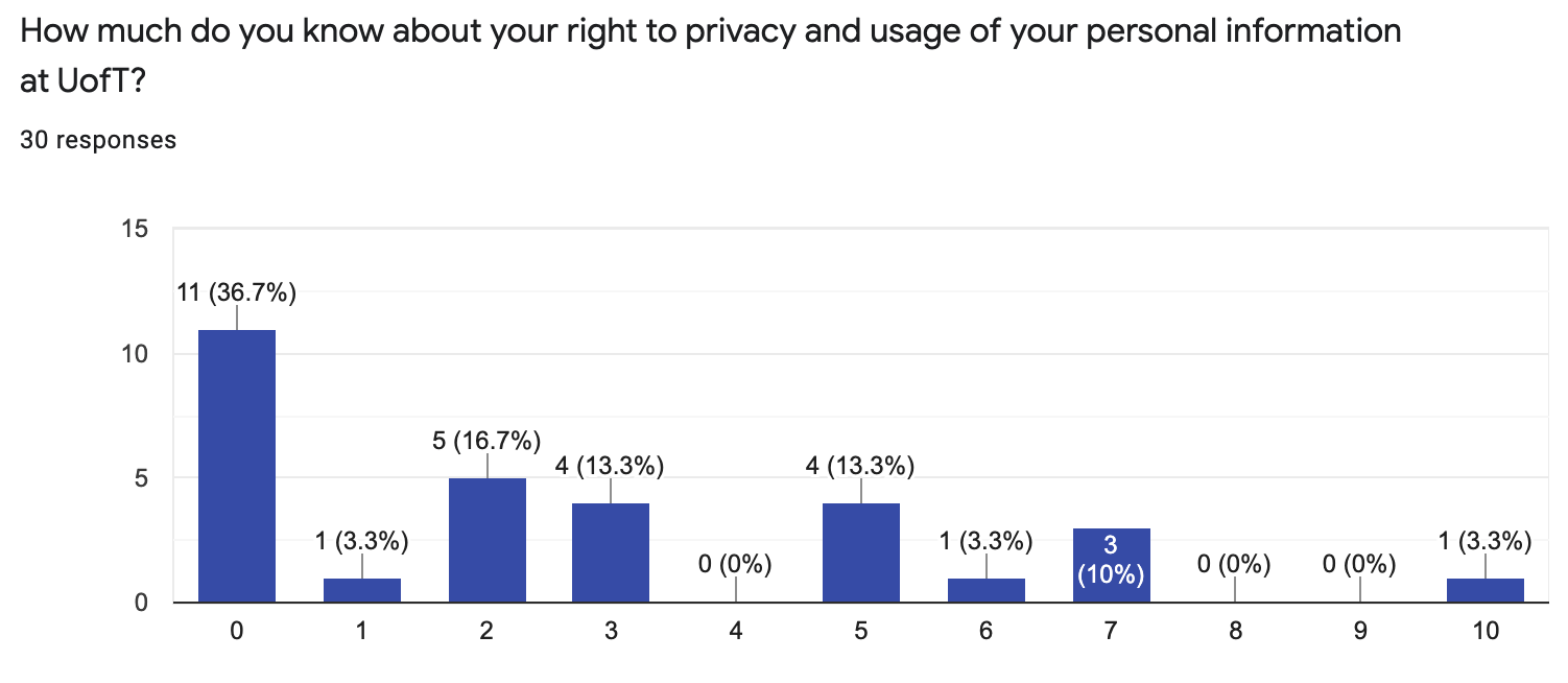
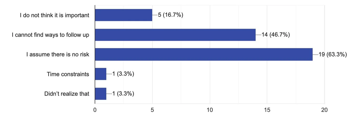
2. Students could not find a way to effectively research about their personal data usage, and most of them just assumed there would be little potential privacy concern as they trust the university.

If not, why?
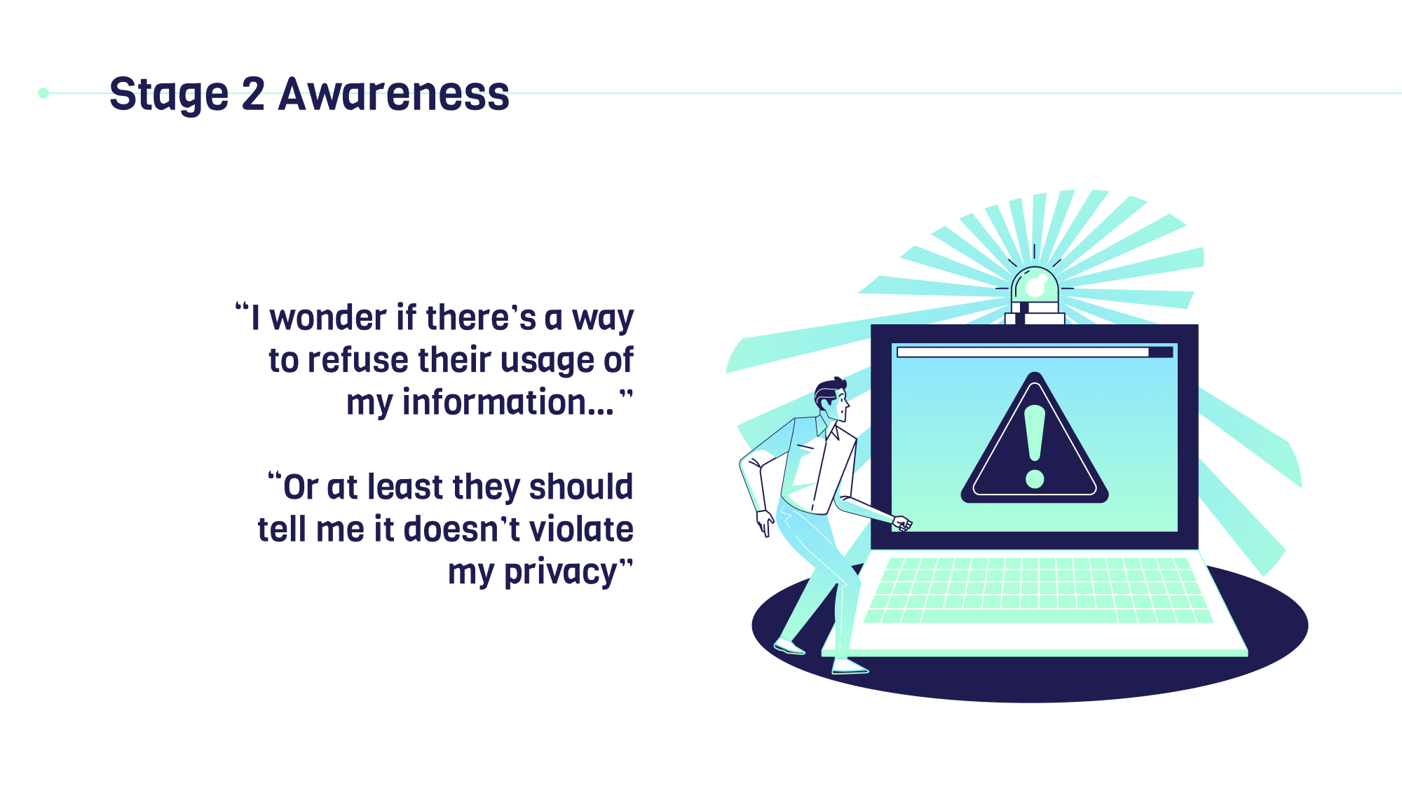
3. Among students who care about their privacy data usage, they were curious about who was using their personal data, what and how their information is used by third-party, and if they can take any action to refuse that usage.

Key themes from the user research

Students consider UofT services as trustworthy & safe, so they assume their information will be protected and barely follow up on this topic.
Most students have never tried to find out more about the use of their personal information due to the unawareness of potential privacy concerns, and the lack of information to follow up.
Students care about privacy protection, as they care about who is using their information and what and how their data is being used for.
Most common ranked the level of importance for the following questions:
What is my information being used for?
Who is using my information?
How long will my information be used?
What restrictions are there on the use of my information?
Persona & Empathy: who has the true needs?
Rescope the target user:
Based on the user research, we noticed many students did not really realize the potential privacy issue. However, it is important to narrow the exploration focus by pruning out facts that relate to research objectives.
We discussed with stakeholders and rescoped the target user group from all UofT students to students who care and may actively search for relevant information.
We also submitted a research report to ITS to better collaborate with other departments to increase students' awareness through workshops or webinars.
Primary Persona: Issac the iSchool Student:

Issac’s empathy when search for privacy data usage information:

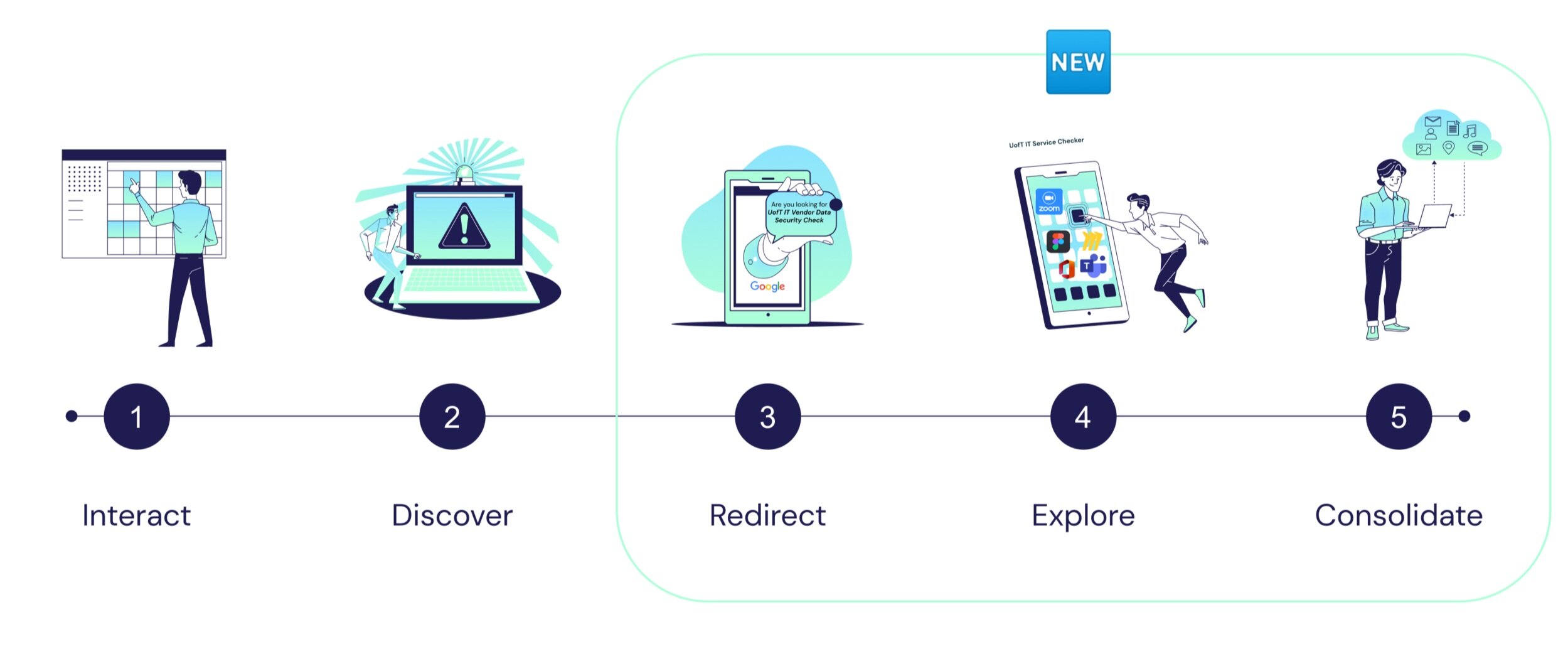
As-is User Journey: Identify gaps
The Experience of Issac when he want to find how a university vendor is using his personal information


Ideate
Ideas on functionality
Q: What is the best way to communicate the information to students?
Our group was mapping need statements, big ideas about features, and scenarios to decide our final deliverables. We proposed two alternative design solutions to stakeholders before the meeting.

Needs Statements
Based on research, we concluded four major needs for our persona - Issac, including exploration, access to information, category types of information, and extra supports
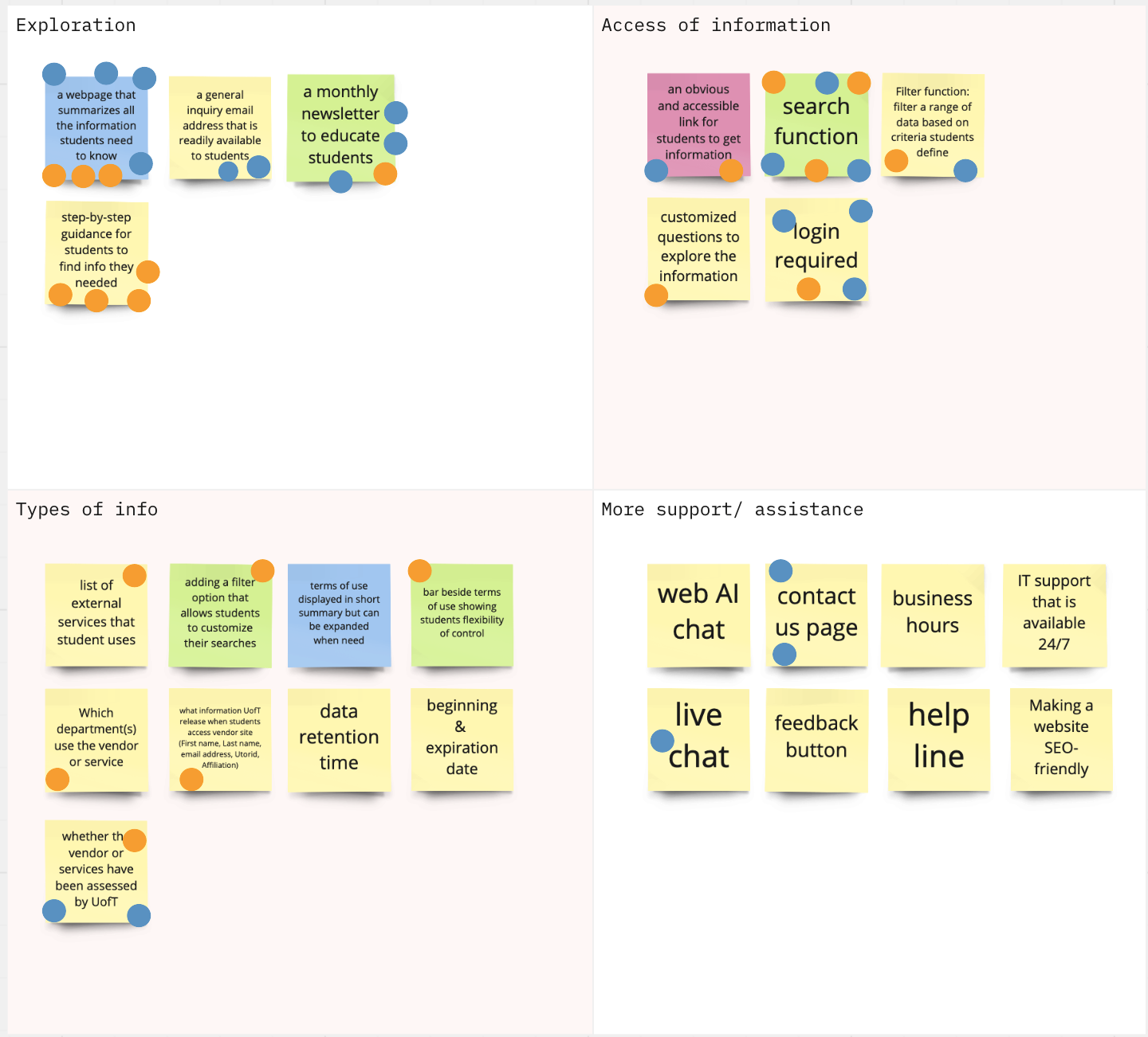
V0ted big ideas
We mapped out 26 big ideas based on transcripts for Issac with 4 themes and voted based on feasibility (blue points) and importance (orange points).
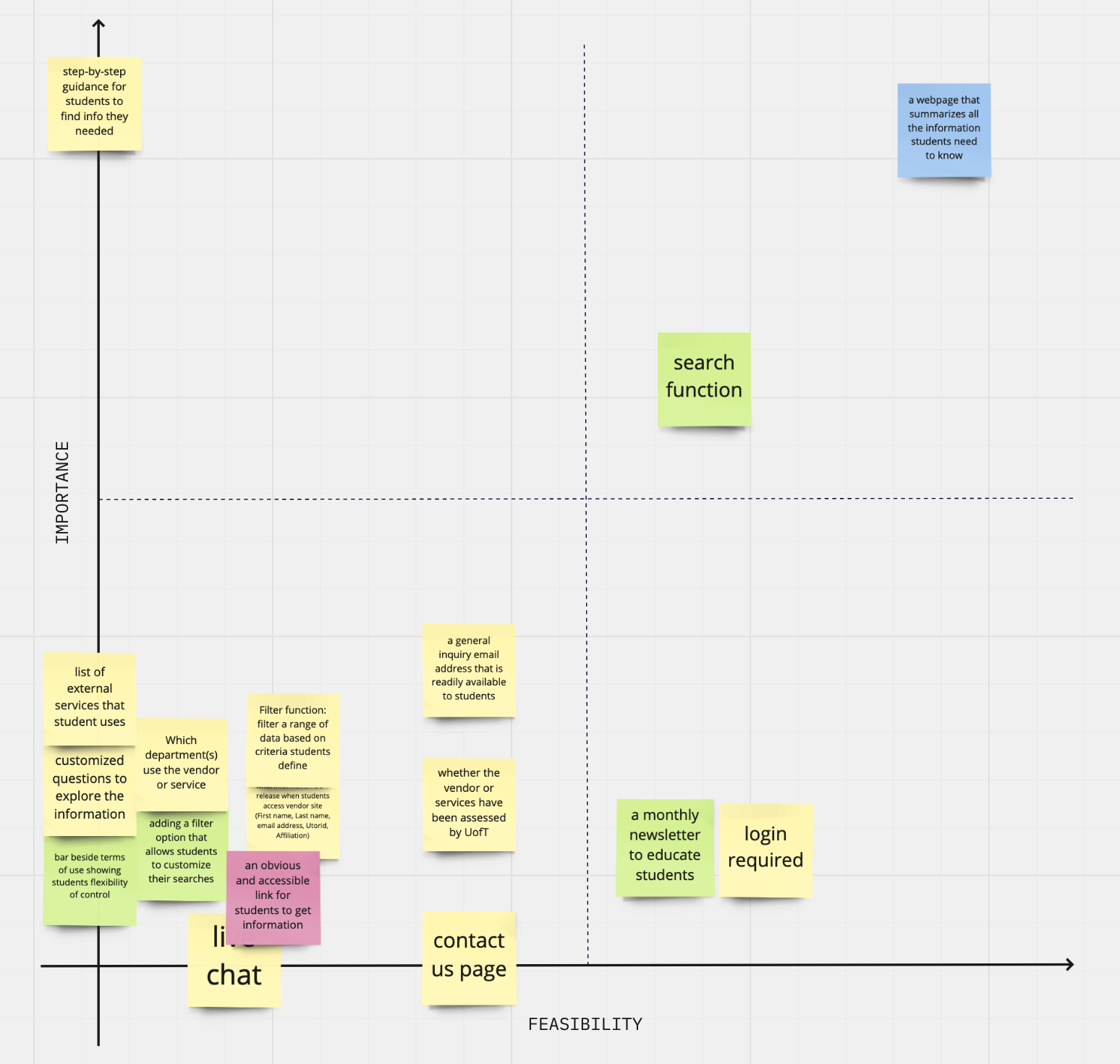
Priortization Grid
Finally, we discussed and placed big ideas with higher votes into the prioritization grid. It is clear that we have many extra features, which give the possibility for future iterations.
Functions: MVP & MOre
Fundamental Features - must have:
step-by-step guidance for students to find the info they needed
the search function
summarize all the privacy usage information students need to know
Extra Features - better to iterate:
filter a range of data based on criteria students define
a general inquiry email address/contacts that are readily available to students
customized questions to explore the information
an obvious and accessible link for students to get extra information
identity verification
Consolidate: Use the Website format to Balance needs and face limitations
To balance the needs of both stakeholders in a valued-centered design approach, we proposed the website format, rather than a mobile app or email notifications.

Proposed Alternatives: Play around creativity within limitations
The final deliverable will most likely be a webpage(s) that would help students to get the information clearly/easily. Depending on the time and stakeholder expectations, we proposed either the basic or ambitious deliverables as depicted below.

Basic Design: Table + Search Bar
(Source: https://www.ucop.edu/cloud-services-contracts/contracts-guidance/index.html )
We will create a webpage with the search function. Users will see a table of listed vendors and their security data usage overview.
The basic functionality would be helping students figure out how many external vendors that have been assessed by U of T have specific student information. Beyond that, we will only list information students care about.

Ambitious Design: Pathways to filter information
(Source: https://securityplanner.consumerreports.org )
The initial land-on page will allow students to customize results with their personal condition or desired information, and the system will automatically filter out information as required.
External service database: this section/web page should contain all external services’ terms of service as promised in partnership with UofT. Students should be able to browse freely and search for particular vendors as desired.
Product Mapping: Guidance is the key
After ideation and client communication, we proposed a combined version of basic and ambitious deliverables, keeping the fundamental functionalities of search and information exploration while adding pages to filter information systematically.

Deliverables
Mid-fidelity Prototype
Design System: University of Toronto

Colors (source: https://brand.utoronto.ca/principles-and-fundamentals/colour/ )

Page Layout (source: https://brand.utoronto.ca/digital-channels/website/ )
The Boundless website uses Bootstrap’s 12-column responsive structure. We design and build pages that display content across the site’s full width.

Typography & Button

StoryBoards
How might we guide students step by step to locate a vendor they want to know?

How might we utilize the search function to guide students?

How might we summarize information that students may care to know and allow for exploration?

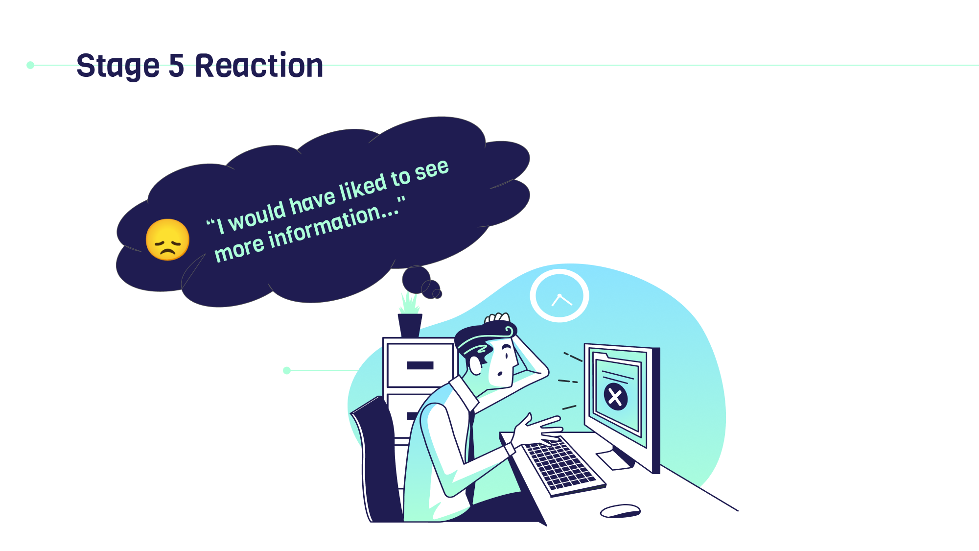
Evaluation and Usability Testing
We conducted a formative evaluation of our design with a representative user using usability testing + interview. Below are the findings:
The design of the search section is a little confusing. The participant didn't realize it is an overlay to the existing webpage. The search section's close icon is not intuitive, which is at the bottom and hard to be noticed.
The functionality of the search bar should be improved. Currently, it was designed only to search for a vendor name. However, users may also want to search for any keywords on the website. Such as faculty names or category names.
More information should be presented on the 'View All Vendor' page. For instance, a brief overview of the vendor can be added when a user hovers on its name.
More information should be presented on the "Vendor Details" page. The information in filters can also be added, such as whether a particular vendor will use students' medical information.
Search Bar Iteration
Key considerations:
Always available: we cannot predict when user what to use it, so it should appear at all screens
Guidance matters: lead users to use this function, and ease their experience & journey when using it
Should not add extra barriers for interactions

Pros: easy to notice, fewer clicks
Cons: only appears at the top of the homepage

Pros: always accessible in the utility navigation, enables frequently searched
Cons: The search bar expands as an overlay can be confused, more clicks
Current Version:

To-be experience map: close the gap
Below is the final to-be experience map that depict the ideal future experience after implementing our design.


Experience Map: Current and Future State

Value Proposition: FIT!

Business Model Canvas: realistic!

Results
Hills: outcomes we meant to achieve
Useful: A UofT student can understand the usage of his/her personal information by different university vendors without spending a long time reading the privacy policies and terms of use from different sources.
Influential: A UofT student can quickly locate the usage of personal information by different IT vendors when they search the keywords on Google to land the UofT IT Checker websites.
Acknowledgeable: A UofT student can get detailed information about what university vendors are used by different programs after browsing the UofT IT Vendor Data Security Check website.
Achievements

Happy Clients 😊
Satisfied with our design solution and valued our efforts.
Confirmed that they would like to carry our design to the next iterations of design and development.
Enjoyed our narrative presentation
Happy Students 😊
All participants would love to use the IT Vendor Checker after it is launched.
Consistency: "I can tell it is a UofT website from the first look."
Clear data presentation: “I like the all vendor page very much. It is intuitive for me to find a vendor name based on the alphabetical order.”
Easy to use and navigate: “As for me, I think it is easy to navigate, and I don’t need anyone to teach me”
The wording is straightforward, with timely explanations: “The tooltips to explain the ‘data level’ and ‘retention time’ are very helpful, so I can know what these words mean. ”
Next Steps
Conduct preference testing for the search function and filter function
Perform heuristic evaluation and accessibility check
Iterate the design based on more usability testing sessions
Sample Potential Measurements (KPI)
Qualitative
Satisfaction
Empathy
User journey
Effectiveness of the search bar
Effectiveness of filters
Complains received
Quantitative
Unique visitors per week
New visitors per week
% of new visitors
Average session durations
Time to find the desired information
Number of requests received
Conclusion
Project Highlights
Followed an existing design system to deliver a standard design
Played around with creativity within restrictions
Facilitated stakeholder product visions via UX research and design
Business proposal with alternative solutions
Balanced needs from multiple user groups
Stakeholder communication + analytical skills
Key Learnings
Scope the project to align values between the organizational needs and user needs. The means of value exchange should consider the interactions between the organization and individuals and consider limitations and the core needs in the current stage.
It is important to prioritize needs. In real life, it is common to break down a large project into more miniature stages, and each stage should focus on its own goal to achieve partial success. The UX team needs to carefully prioritize the needs to draft out a long-term plan for product iteration.
Prune out facts that relate to research objectives. Narrowing down the focus of exploration based on the research goal is a key to effective ideation. A project does not necessarily have multiple personas. It is not always the more, the better. Sometimes, too much user segmentation may lead to a loss of focus and an overwhelmed project scope. In the future, I should always remember that circumstances alter cases.