| User Interface design |
MeDossier: Mobile medical dossier
MeDossier is a health management App that targets mainly mid-age people. It comes with four major functionalities: recording body status, managing health records, receiving health guidelines, and generating emergency medical information.
Project Type: User Interface Design, IOS Design system adherence, Product design
My Role: This is a course work solely completed by myself. As a UI designer, I transformed client briefs into digital products
Timeline: March 22 to March 26, 2019
Tools: Figma, Illustrator, Overflow
Skills Developed: User Interface design, Design Critique, IOS Design System, Design specification, Sketching, Storyboarding, Prototyping
Challenge
How to build a centralized and accessible lifelong record of medical information with both aesthetics and efficiency of focus?
How to decide what kinds of medical information and capabilities would like to carry with us at all times?
Moreover, the application has to be used on the go, subject to all the constraints of mobile computing.
Originality & differentiation
App Name
MeDossier = My Medical Dossier
Three Key Tasks in the prototype:
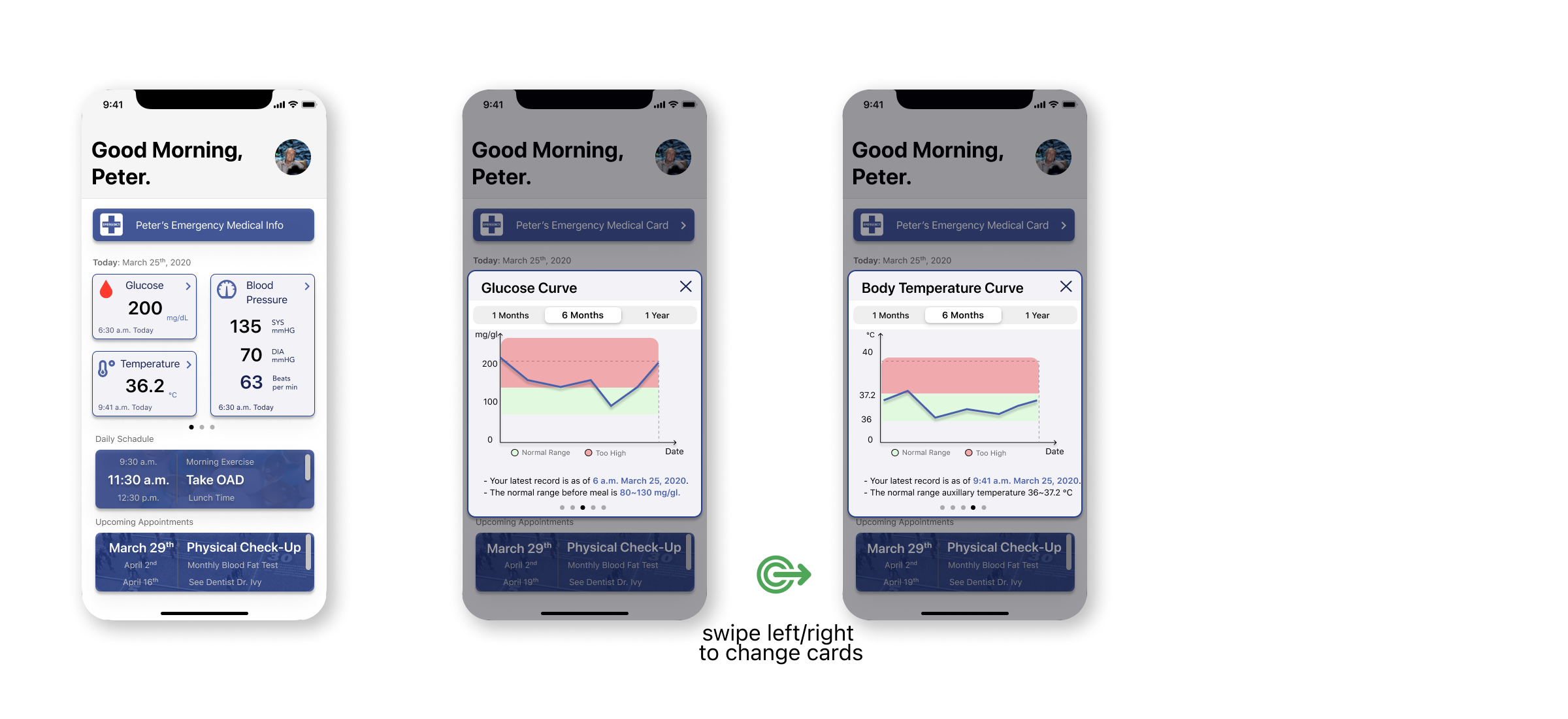
1. Recall and update the user’s daily health status, and view the numerical record in visual trends.
2. Manage a complete history of appointments, immunizations, prescriptions, etc.
3. View and edit users necessary information, contacts, and medical specifics, which can be used in an emergency.
Design Rational
The overall design rationale is to adhere the IOS design system, while presenting a clean and elegant interface to target users with clear layout and hierarchy.
Colors

With respect to the IOS design system, I use the grayscale colors (primary background color, text color, and highlight colors) from the IOS UI KIT, then choose blue and white as theme colors. Blue has a natural connection with the medical and hospital, which also tells clean, calm, and technological feelings – so it is a perfect fit for this mobile medical dossier.
To show the sense of high-fidelity design, I overlap related images with the blue theme color in different sections. Those images are also ways to remind users as hints and show consistency.


Typeface & Icons
All typefaces are SF Pro Display, with respect to the IOS UI KIT for size and weight instruction to guarantee consistency and hierarchy. However, considering that the target users are middle-age and senior people, I choose relatively large font sizes to display critical information. The use of icons also helps to convey meaning and aid scanning. As a result, users may not have to read all caption texts - icons and images can aid communication without language.

Logo & Branding
The initial splash screen has the same blue + white theme color as other inner pages. The logo is a medical record icon, with a capitalized ‘M’ on it to recall our App’s name, MeDossier. The name comes from Med(ical)+Dossier, while ‘Me’ is also the first-person pronoun to remind of ‘My’. Thus, the name is meant to remind the user with ‘My Medical Dossier’.
The Interface Design
User Needs #1: How might we create a secure online record?
Design Solution #1: Add a double verification process.

User Needs #2: How might we carry medical information and capabilities at all times?
Design Solution #2: Recall and update the user’s daily health status and view the numerical record in visual trends.

User Needs #3: How might we build a centralized and accessible record of medical information?
Design Solution #3: Manage a complete history of appointment, immunizations, prescriptions, etc.

User Needs #4: How might we rely on one platform during a medical emergency?
Design Solution #4: View and edit users’ necessary information, contacts, and medical specifics, which can be used in an emergency.

Live Prototype
The interactive prototype can also be retrieved via this link.
Thanks for reading.