| User Experience |
Study Space Finder @ UTSG
December 2019
A one-stop mobile app provides comprehensive information about a study space’s real-time capacity, services, regulation, location, and navigation on the University of Toronto St. George Campus.
Project type: A cohesive end-to-end UX project for an IOS mobile application design that was initiated from real-life design challenges
My role: UX/interaction design, visual design, user research
Tools: Illustrator, Balsamiq, Figma, iMovie, Lucid chart, usertesting.com
Skills developed: Contextual research, project planning, user research, UX analysis, wireframing, prototyping, usability testing, presentations

Study Space Finder Overview
The Problem
“How to help UofT students finds their ideal study space on campus?”
There are 44 libraries on the University of Toronto St. George campus (UTSG), and over 100 faculty buildings that also contain study zones, but still many complain about hard finding a seat in their ideal study space.
The Solution
Design Process

Discovery
Based on the contextual observations, we made several assumptions to define the problem scope. As a post-graduate student at the University of Toronto, conducting self-study on campus has been one of their essential daily activities, but the overall experience is not as streamlined or desired.
To validate our assumptions and gain a deeper understanding of our users and their use scenarios, we conducted a secondary comparative analysis of existing products, and primary user research using surveys and interviews.
User Research: Surveys + Interviews
We collected 56 anonymous survey responses via Google Survey, then conducted 8 semi-structured interviews with selective survey responders.
-
Intuitively integrate a design solution for university students to find their ideal study space on the University of Toronto St. George campus (UTSG).
Objective #1: Discover how UTSG students research and choose the study space they would love to stay in.
Objective #2: Gauge the effectiveness and identify utility gaps to their current solutions to validate the needs of our product.
Objective #3: Determine strategic areas of opportunities across their as-is journey to determine possible functionalities.
-
post-graduate students, user habits, user flow efficiency, integrated digital solution
-
UTSG students
Domestic & international students
Present and/or experience on UTSG campus
Research Findings
Quantitative research results from survey responses
The majority of participants felt that their study space choices are limited due to the lack of acknowledgment. They tend to visit several spaces that fit their preferences criteria due to the unconsciousness to explore more options. These findings validated our previous assumptions and confirmed the usefulness of our proposed product.

Qualitative research results from interviews + survey responses
Participants were asked to share their stories when they were looking for satisfactory study space on campus. Most of them noted more difficulties than cheerful moments. The interview data also provided further details of their requirements and criteria to an ideal study space, which is valuable to inform our design decisions.


Participants described their seat searching experiences as painful and disappointing. Currently, students have to switch between different platforms to find a study space that fits their needs; but still, no product provides real-time capacity features.

Persona: Meet Stephanie! 👋
We created a proto-persona according to the initial research, highlighting representative attributes of our target users of confusion to the service available, curiosity to explore campus, and fear to get lost. Empathizing with her, we could better ideate our digital product with a specific focus.

Ideation
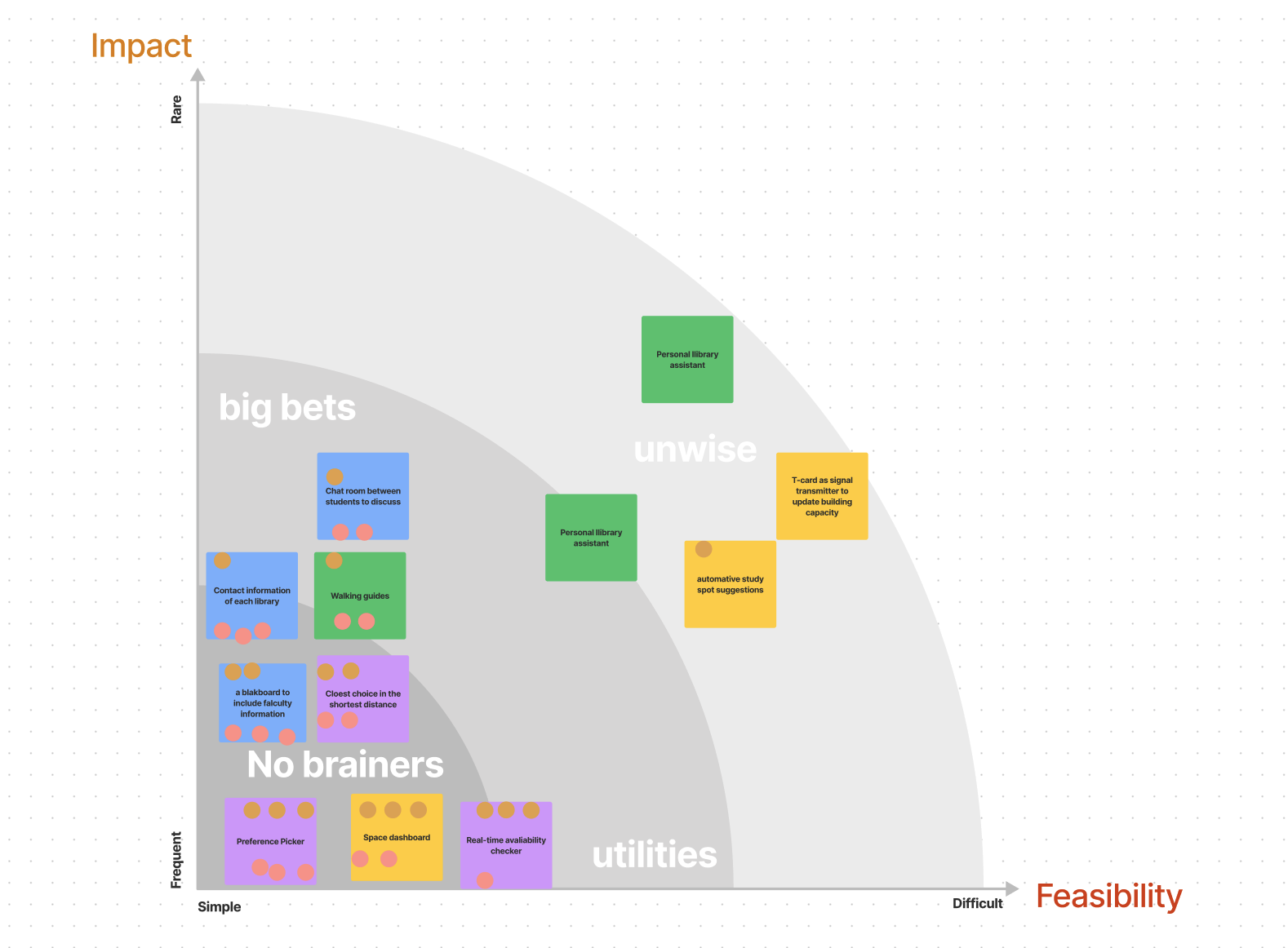
Learning from the user analysis and research findings, we identified 4 users’ needs and considered how to help Stephanie to find her ideal study space easily. Our group mapped need statements, big ideas, and scenarios. Using requirement analysis, we ideated key features by proposing a prioritization grid voting.
Stephanie needs a way to….
-
She needs to know whether there is an available spot so she won’t waste time finding it.
-
She needs to know more libraries/buildings available on campus, so she can expand her choices based on acknowledgment.
-
She needs to know where is the closest ideal study space so she won't walk extra.
-
She needs to know the rules, restrictions, & services of buildings so she can select the ideal study space.
Ideas on functionality
We mapped out a prioritization grid to group 12 big ideas by levels of impact and feasibility.
More questions we considered:
Setting up preferences: one-time setting or editable filters?
Real-time capacity update: what is the accurate and cost-efficient way to provide seat availability?
What are the motivations for the university to invest in our product?
Our discussion:
Embedding the customization setting as part of the onboarding process, while keeping flexibility for users to add/remove any filters for each search behavior.
Borrowing the idea of crowdsourcing API to estimate the heat map of each location based on their capacities. While allowing users to provide quick feedback on the real-time availability. Instead of showing a specific number of available seats, provide a progress bar to hint at capacity.
Arguing the resource wasting and the cost-efficient ratio of building a mobile app than building new faculty buildings. Also presenting the results of comparative analysis and user research to prove the need to change.
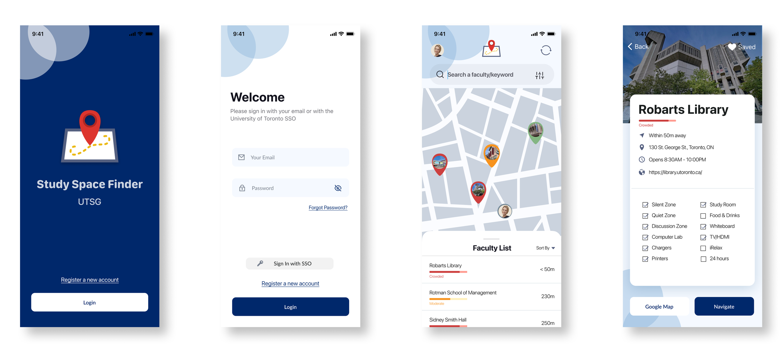
Key Features
Converged from 12 big ideas, 3 themes of Availability, Preferences, Information emerged. We decided to focus on the below prioritized features to guide our further design:
-
Register as a new user or login as an existing user. Splash screen with UofT authentic branding.
Step-by-step guidance in setting up user preferences. Allows for customization to remember the user’s unique default settings to study spaces.
-
Help users to find their ideal study spaces based on customized sorting of preferences, distance, and filters.
-
Allows users to view details of a certain study space. Displaying a one-stop canvas of information, so users do not need to jump between different sites.
The real-time availability is provided based on a crowdsourcing algorithm of mobile signal and library PC registration data.
-
Allows the user to use a build-in navigator to their selected study space. At the same time, having a Google Map shortcut provides user freedom.
Integrating nicknames of each UofT building.
To-be Storyboard

Prototypes & Evaluations
Continuing on this theme of Availability, Preferences, Information with more specific features, we developed 3 design iterations (low-fidelity sketch, improved mid-fidelity draft, and polished mid-fidelity mockups). As evaluation reiterating in each round of our design process, we conducted evaluation studies after each round of prototyping to inform solution improvements.
Iteration 1. Low-fidelity Sketch
Please click the image to zoom larger.
Evaluation 1. moderated usability testing

Result:
In general, all 3 potential users were able to follow the flow of the prototype and finished all 3 tasks. They provided a 3.5 out of 5 overall ratings of usability to this low-fidelity prototype, and the areas of improvement include:
All 3 users got lost on the account setting page, they do not know how to quit or jump the settings. Considering changing the wordings.
2 users wondered how to get back from the listing page. Considering adding a hint or a back button.
1 user needed a “smarter” search bar. Considering allowing users to search keywords for their preferences.
Iteration 2. improved medium fidelity prototype
Highlight Changes: low-fi sketches (left) vs. mid-fi improvements (right).


evaluation 2. product polishing
Methods
In order to approach the real thoughts of our users, we applied a full triangulation method:
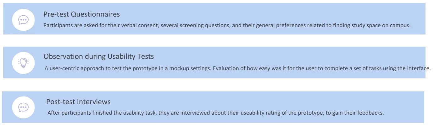
Research Data & Findings
The evaluation successfully helped us to identify areas for improvement in the current prototype design:
Provide more help documents & guides, add textual instructions when needed, rearrange the path, and remove the duplicated functions.
All 5 participants, who are also our potential target users, agreed that our Study Space Finder App will be useful, and can help them to find an ideal study space more efficiently.
They liked our product, and they will recommend the product to their friends.


Iteration 3. polished Mid-fidelity Mockups
Click to View Product Video + Clickable Prototype.
Meet Our Group 😊


Follow-up: High-fidelity Mockups
Research guided our design decisions, and evaluations iterated our design solutions. The upfront user research and usability tests gave us the confidence to present our product in 4 playback studios and in front of 30+ industry experts.
After my team and I completed this project, I’m continuing to create high-fidelity mockups to conceptualize the desired outcome.

Thanks for reading.