| User Experience |

Study Space Finder @ UTSG

A mobile App provides comprehensive information about a study space’ real-time capacity, services, regulation, location and navigation on University of Toronto St. George Campus. It aims to help improve students’ experience of finding an ideal study space on campus, with high satisfaction on a single platform.


Project type: This project covers the whole user experience design process, including user research, usability assessment and interface design for digital products in educational sector, using a user-centric design methodology.

My role: In a team of four, I contributed in research, analysis, design strategies, prototypes, and evaluation of our digital products.

Domain: University of Toronto, St.George Campus

Tools: Illustrator, Balsamiq, Figma, iMovie, Lucid chart, Google Survey, MS Powerpoint / Excel

Skills: Contextual research, digital product development, user research, empathy map, persona, sketching, wireframe, storyboard, prototype, usability testing, presentations


Challenge

There are 44 libraries on the University of Toronto St. George campus (UTSG), and over 100 faculty building where also contain study zones, but still many complains about hard to find a seat at his/her ideal study space.

Design Process

 
ut+process.png
 

Discovery


Self-study on campus has been one of the essential activities students do everyday. However, it is not always easy to find an ideal study space for ourselves: sometimes no seat, sometimes too far to walk around campus.

How can students find comprehensive information about all study spaces’ real-time capacity, services, regulation, location and navigation on U of T St. George campus? .

Self-study on campus has been one of the essential thing that we do everyday.However, it is not always easy to find an ideal study space for ourselves: sometimes no seat, sometimes too far to work around campus.“There are 44 libraries on campus, and…


User Research

We collected 56 anonymous survey responds via Google Survey, and conducted 8 semi-structured interviews with undergraduate students from University of Toronto St. George campus (UTSG). Participants had significant coverage of domestic and international students, present and past UTSG undergraduate students, all colleges, and various programs of study. 

Here are some of their answers and data we collected:


Q: Please share a story about you looking for a study space on campus. How was the experience? Any cheerful moments or difficulties?


Challenges.jpg


Q: Do you have any preference for study spaces? What are the requirements or criteria to an ideal study space on the campus?


Portfolio+%282%29.jpg
 
 
Portfolio+%283%29.jpg


Persona & Empathy

Meet Stephanie 👋

We developed a persona, Stephanie the student, and her empathy according to the user research and analysis.

In general, Stephanie wants to find a study space, but she is very lost in the campus. She does not familiar with anything, but she has four needs when deciding a place to study, which are seat availability, walking distance to the current faculty or destination, the more faculties available for self-study, and other different regulation to set preference.


Current User Journey

Currently, students have to switch between different platforms to find an ideal study space; but still, no product provides real-time capacity features.

 
as-is (1).png
 

Ideate & Justify Features


Ideas on functionality


Our group were mapping need statement, big ideas about features, and scenarios during work studios. (click images to view details). Using requirement analysis to define ‘the ideal study space’, and decide which features to include in our product to help students find their ‘ideals’ by proposing a prioritization grid voting.

needs statements.png

Needs Statements

Based on research, we concluded four major needs for our persona - Stephanie, including availability of spots, information regarding faculties, distance to current location, and preferred services.

 
bigideas.png

Mapping big ideas

We mapped out 9 big ideas for Stephanie with 3 themes, which include distance, information, and preference. Accordingly, among the ideas, we also had 3 absurd ideas which are shown in grey sticky notes. They may, however, inspire us of other big ideas.

 
tobe.png

To-be scenario

This is Stephanie’s experience with our product will all features.

With the Study Space finder, she can use her phone to locate the nearest seat to her faculty, which also fulfill all her needs.


Prototypes & evaluations


The Happy Path

Then, we applied the features and organized them into the app to form the happy path, which include 5 major themes:

1. Login: or register.

2. Set Preference: customize to make system remember users’ unique default settings.

3. Find Study Space: show by preference, for closest study space, sorting, and add filters to users’ search.

4. View Faculty Detail: show details of a study space, including services, regulations, open hours, etc.

5. Navigation: a build-in navigator to the selected study space.


Iteration 1. Low-fidelity and usability test

Below is the low-fidelity sequential storyboard and the interaction design. We did a usability test with 3 participants and 3 tasks based on this version, then improved accordingly.


Please click the image to zoom larger.


Evaluation 1. Lean Evaluation based on low-fi (moderated usability testing)

Process: 3 potential users, 3 tasks, 3 testers, 4 steps​

Tasks:

  1. Check the walking distance to the Gerstein Science center

  2. Find the closest library and how to walk there

  3. Find all study spaces with charger

Result:

In general, all 3 potential users were able to follow the flow of the prototype and finished all 3 tasks. They provided a 3.5 out of 5 overall ratings of usability to this low-fidelity prototype, and the areas of improvements include: 

  • All 3 users got lost in the account setting page, they do not know how to quit or jump the settings. Considering to change the wordings.

  • 2 users wondered how to get back from the list page. Considering adding a hint or a back button. 

  • 1 user needed a “smarter” search bar. Considering allowing users to search keywords for their preferences.


Iteration 2. improved medium fidelity prototype

Highlight Changes: lefts are low-fi sketches, and rights are mid-fi improvements with Balsamiq. Please click images to view details.


evaluation 2. product polishing

We conducted another round of evaluation to polish our product design.

Methods

In order to approach the real thoughts of our users,  we designed a full triangulation methods:

evaluation+methods.jpg


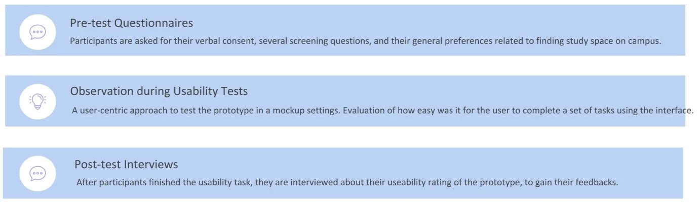
Research Data & Findings

  1. The evaluation successfully helped us to identify areas for improvement in the current prototype design:

    • Provide more help documents & guides, add textual instructions when needed, rearrange the path, and remove the duplicated functions.

  2. All 6 participants, who are also our potential target users, agreed that our Study Space Finder App will be useful, and can help them to find an ideal study space more efficiently.

  3. They liked our product, and they will recommend the product to their friends.


Iteration 3. polished Mid fidelity prototype


View Product Video + Clickable Prototype at here.


| information architecture |

Pet Store E-Commerce Platform


Redesigning the e-commerce platform of an Ottawa-based pet store to better serve its functionality with an improved information architecture (IA),

by adding layers on navigations and simplifying contents to be simple and elegant. 


Project Type: E-commerce website redesign, Information architecture re-organize, UX research, website iteration, usability assessment

My Role: In a team of five, I designed and led primary research, conducted data analysis, created prototypes and organized the final design proposal

Client: Natural Pet Foods, Ottawa, ON, Canada

Tools: Figma, OptimalSort, Photoshop, Illustrator

Skills Developed: User interviews, Usability testing, Information architecture analysis, Sketch, Storyboard, Prototype, Heuristic evaluation


Challenge

 The current functionality of the website is valuable, but the navigation labels, illegible fonts, and low-pixel images are frustrated. To gain profit through selling pets-related products and boosting transactions, it is vitally important for the e-commerce platform to ensure an impeccable overall experience.

Design Process

 
petprocess.png
 

Research


Contextual Background Research

Audience: Pet owners who are looking for food and/or accessories for their pets, especially those without by-products and chemical preservatives, and also pet lovers and potential owners.

Our background research started with the following questions:

  • What are the goals of this project?

  • Who are the intended audiences?

  • What types of tasks should users be able to perform?

  • How is the current content created and managed?

The context analysis was based on a review of the website, stakeholder meeting notes, and competitor analysis. As a result, we conclude the traits of design should focus on highlighting natural, dietary standard, and good quality as competitive advantages.


User Research

Semi-structured Interviews

3 interviewees, open questions on their background, comments on current structures, general usability and experiences.

Usability Tests

3 participants, 10 tasks;

4 testers: 1 host, 1 observer, 2 note takers.


3 major IA PROBLEMS are identified

“Too many labels (34!) in the primary level of navigation!”

“Too Deep to Find the product!”

“Why there are two search bar?“

“what does this label mean?“

1. Organization and labelling system is very unorganized:

Having both vertical and horizontal navigation bar takes audience longer to locate information; some labels have ambiguous titles.

Heuristic violated: Too many labels; Flexibility and efficiency of use.

2. Top-down IA only and no bottom-up IA in the current design:

Primary menus contain every link in the whole website. No assistive guidance (breadcrumbs) to let users know where they are and what their previous product pages are

Heuristic violated: Hard to back; Require recognition but not recall.

3. Readability issue with the site due to improper font and poor design:

Some of the main pages have more than 10 secondary navigation links, while the font is even illegible.

Heuristic violated: Lacking match between system and the real world.

The Original website - with a messy Information Architecture

The Original website - with a messy Information Architecture


Card Sorting Activity

With the card sorting results, it will help to know our potential audience's expectation of grouping and labeling, so we will be able to organize the website's information in a way that makes the most sense to our audience.

By doing so, we will be able to create a new primary level of navigation, by grouping the current vertical and horizontal navigations according to the potential users' perception, and re-wording the label for their convenience.

34 Cards

We created a card sort study with 34 labels from primary levels of both horizontal and vertical global navigation menu. Most were current labels used on the website and a few were modified/generated based on feedback from users and stakeholders.

6 Participants

They have different pets experiences, and are different genders, from different regions. No one has IA knowledge, but all has online shopping experiences. They are invited to join the card sorting activity from OptimalSort.

The activity can be accessed at here, and the result is can be found at here.


Card findings

9 major categories emerged

- Participants took very different approaches to sort the cards

label results .png

Labels should be renamed

-Some labels are named misleading, so participants are confused.


Prototyping


Preliminary Sketches

Below are sketches of major pages with improved search system, organization system, label system, and navigation system. (*Please click the image to view lager)


The Information Architecture Schematic Diagrams

BEFORE: The Original Information Architecture Structure

AFTER: The Re-designed Information Architecture Structure

The Original IA Structure

➔ Horizontal + Vertical Global Navigation

➔ Too Many (7 + 28) Categories

The Re-designed IA Structure:

➔Much Less (9) Categories, Added Bottom-Up IA

➔Regrouped Categories by Creating A New Primary Nav.


Storyboard: New User Journey

 
Mid+Fidelity+storyboardddd.jpg

| User Interface |

MeDossier: Mobile medical dossier


MeDossier is a health management App that targets mainly for mid-age people and seniors. It comes with four major functionalities: recording body status, managing health records, receiving health guidelines, and generating emergency medical information.


Project Type: User Interface Design, IOS Design system adherence, Product design

My Role: This is a course work solely completed by myself.

Tools: Figma, Illustrator, Overflow

Skills Developed: User Interface design, Design Critique, IOS Design System, Design specification, Sketching, Storyboarding, Prototyping,


Challenge

 In 3 days, how to build a a centralized, secure, accessible lifelong record of medical information with both aesthetics and efficiency of focus?How to decide what kinds of medical information and capabilities would like to carry with us at all times?

Moreover, the application have to be used on-the-go, subject to all the constraints of mobile computing.


Originality & differentiation


App Name

MeDossier

Three Key Tasks in the prototype:

1.      Recall and update user’s daily health status, and view the numerical record in visual trends.

2.      Manage a complete history of appointment, immunizations, prescriptions, etc.

3.      View and edit user’s necessary information, contacts, and medical specifics, which can be used in an emergency.


Design Rational


The overall design rationale is to adhere the IOS design system, while presenting a clean and elegant interface to target users with clear layout and hierarchy.


Colors

a2.jpg

With respect to the IOS design system, I use the grayscale colors (primary background color, text color, and highlight colors) from the IOS UI KIT, then choose blue and white as theme colors. Blue has a natural connection with the medical and hospital, which also tells clean, calm, and technological feelings – so it is a perfect fit for this mobile medical dossier.

To show the sense of high-fidelity design, I overlap related images with the blue theme color in different sections. Those images are also ways to remind users as hints and show consistency.

index+page+with+menu.jpg
my+records+%281%29.jpg


Typeface & Icons

All typefaces are SF Pro Display, with respect to the IOS UI KIT for size and weight instruction to guarantee consistency and hierarchy. However, considering that the target users are middle-age and senior people, I choose relatively large font sizes to display critical information. The use of icons also helps to convey meaning and aid scanning. As a result, users may not have to read all caption texts - icons and images can aid communication without language.

fonts.png
 

Logo & Branding

The initial splash screen has the same blue + white theme color as other inner pages. The logo is a medical record icon, with a capitalized ‘M’ on it to recall our App’s name, MeDossier. The name comes from Med(ical)+Dossier, while ‘Me’ is also the first-person pronoun to remind of ‘My’. Thus, the name is meant to remind the user with ‘My Medical Dossier’.

initial+splash+screen.jpg

The Interface Design


High fidelity prototype overview


High-Fidelity Storyboard

I illustrated the user path when performing three tasks for major functionalities:

1.      Recall and update user’s daily health status, and view the numerical record in visual trends.

2.      Manage a complete history of appointment, immunizations, prescriptions, etc.

3.      View and edit user’s necessary information, contacts, and medical specifics, which can be used in an emergency.

(*Please click the image for larger, or click here to view it in a new tab.)


Live Prototype

The interactive prototype can also be retrieved via this link.